Publishing peer-reviewed journals and research reports are integral to the research dissemination process; however, these resources are often inaccessible and unknown to the wider public(s). While it is important to continue to share such publications on your social media channels, there are many other mediums that are more engaging and user-friendly for the public.
Given the volume of information available online, it is important to create a smoke signal around your research. Presenting your research using a diversity of formats will help make it more discoverable. While some people enjoy short, high-level videos, others prefer in-depth data visualizations. Therefore, reformatting your research outcomes helps offer multiple points of entry for a diversity of audiences.
Reformatted media: videos, blog posts, data visualizations, music, art, video games, podcasts, and displays or exhibits.
Data visualizations are a great way to present data in a visual format. From GIFs, interactive animation (likely using HTML 5), and video games to maps, charts, and graphs, they come in many different shapes and forms. We have compiled a set of general best practices that we follow when creating data visualizations.
It is important to make visualizations attractive and topical to effectively communicate your data. Be mindful of design best practices as aesthetics play a key role in attracting audiences and maintaining their interest.
Forget the Snowy Winters of Your Childhood by Naël Shiab
Collaborating with artists or designers to develop data visualizations will help make them more engaging to users. Since artists can potentially help audiences engage with your data or research on a more visceral level, invite them to collaborate with you throughout your research process rather than working independently.
The Shape of Change by Val Britton
Clarity in design is closely related to aesthetics. When developing a visualization, it is important to consider whether design elements or artistic features are adding to or detracting from its clarity. Ensure that one element is not privileged over the other. Furthermore, it is important for users to be able to understand data at a glance.
Climate Spirals by Ed Hawkins
Interactivity is a key feature in data visualizations. Clickable content and the ability to trigger animations, for example, can help visualizations engage and maintain user interest. While static visualizations are inherently important when communicating data to specialists, interactive visualizations are best suited for general audiences.
Art, Aesthetics & Making the World a Better Place Map by Changing the Conversation
One visualization format is not necessarily better than another, especially since audiences are drawn to different media types. Therefore, your communication strategy should present multiple types of visualizations in a complementary fashion. For example, when designing an interactive visualization, include a link to time-series graphs plotting your research trends.
A Picture of Electrical Energy Use in Canada by MC3: Meeting the Climate Change Challenge
It is important to make visualizations attractive and topical to effectively communicate your data. Be mindful of design best practices as aesthetics play a key role in attracting audiences and maintaining their interest.
Forget the Snowy Winters of Your Childhood by Naël Shiab
Collaborating with artists or designers to develop data visualizations will help make them more engaging to users. Since artists can potentially help audiences engage with your data or research on a more visceral level, invite them to collaborate with you throughout your research process rather than working independently.
The Shape of Change by Val Britton
Clarity in design is closely related to aesthetics. When developing a visualization, it is important to consider whether design elements or artistic features are adding to or detracting from its clarity. Ensure that one element is not privileged over the other. Furthermore, it is important for users to be able to understand data at a glance.
Climate Spirals by Ed Hawkins
Interactivity is a key feature in data visualizations. Clickable content and the ability to trigger animations, for example, can help visualizations engage and maintain user interest. While static visualizations are inherently important when communicating data to specialists, interactive visualizations are best suited for general audiences.
Art, Aesthetics & Making the World a Better Place Map by Changing the Conversation
One visualization format is not necessarily better than another, especially since audiences are drawn to different media types. Therefore, your communication strategy should present multiple types of visualizations in a complementary fashion. For example, when designing an interactive visualization, include a link to time-series graphs plotting your research trends.
A Picture of Electrical Energy Use in Canada by MC3: Meeting the Climate Change Challenge
Blogs are a great way to quickly publish your research outcomes using a more casual tone. They help assert the relevance of academic research online (when following best web practices), encourage academics to reflect on and communicate their outcomes throughout the research process, and feed regular content to social media channels. They also give academics the opportunity to circulate accurate, reliable, and trustworthy information in an online climate that is highly susceptible to misinformation and ideological trolling. They are the perfect platform to embed or hyperlink to important resources and references. Furthermore, blogs can engage readers early in the research process, which helps build anticipation of final results.
Another benefit of blogs is their ability to reach new audiences or audiences who do not generally gravitate towards or have access to peer reviewed journals. They can help humanize the research process by putting a face behind the page, so to speak, making it easier for audiences to connect to academics. Furthermore, our research shows that students with an above average level of knowledge on social and environmental issues read blogs regularly (Dale et al., forthcoming). This is a medium that will help you assert your ideas online while enhancing public access to your knowledge.
To ensure your writing is accessible, use plain language and avoid using academic jargon. Adopt the museum method of writing at a grade five reading level to ensure audiences with different reading levels and language abilities can understand your work. Also, keep your sentences short.
Blog posts are often casual in tone, so presenting your research outcomes using a narrative framework is a great way to liven up your work. This will not only help personalize your post but also give your writing more energy. Think of it like having a conversation with your readers.
Save the lengthy writing for your peer-reviewed journal articles and reports. Our research shows that readers ages 18-34 prefer 1-3 paragraphs, so try to limit your average post to 500 words or less (Dale et al., forthcoming).
Write a variety of post types including: short reflections; research updates; in-depth articles (only occasionally); interview highlights (if given permission to publish); media embeds with short description (videos, data visualizations, etc.), announcements; news; etc.
Include one or more images, videos, data visualizations, audio files, podcasts, GIFs, etc. in your blog posts. This will help break up the text and include different content types that will help communicate and support your ideas.
Link to outside sources such as reports and datasets, rather than digressing with in-depth explanations (unless that is what your post is centred on). For example, when referencing ideas or statements from reports, make sure you provide a link to the report and encourage your readers to explore it further.
Use descriptive and thought-provoking titles. This is what will appear in social media previews, so it is important to grab your reader’s attention.
Grab your reader’s attention in the first sentence and/or paragraph as the average time spent on a single webpage is less than 15 seconds.
Do the work for your readers. Insert social media copy promoting your blog post in the ‘alt tag’ of the image. This will help index it in image searches and will auto-generate text when shared by other users on social media.
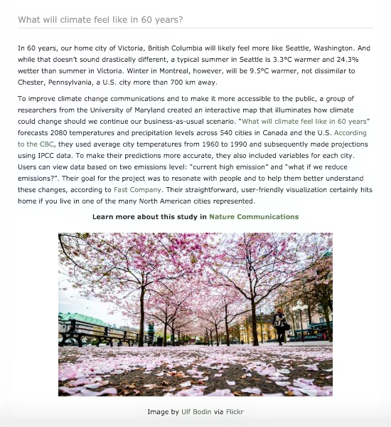
Figure 10: A CRC Research blog post outlining a recent climate change study.
We have experimented with leading real-time, virtual conversation for many years using our e-Dialogue platform, Changing the Conversation. As a simple text-based discussion forum, this communication channel hosts conversations about a variety of topics to help rethink and reframe modern day challenges. As a democratic, intergenerational and inclusive platform, it helps bridge the divide between academics, practitioners, decision-makers, and the public. This type of forum is a great way to collect data, bring together experts, publicly share ideas, or to collect data through a virtual focus group. They are less pressure than panel discussions and they offset the financial and environmental costs of meeting in person. Furthermore, they generate transcripts that are great for data analysis as they are a text-based medium.
To ensure conversations are civil, respectful, and productive, moderate the conversations (like a panel discussion moderator).
Prepare questions ahead of time and send them to your panelists. This will give them time to prepare their answers and ensure their ideas are more thoughtful.
Address your panelists by name and call on them to clarify or elaborate on ideas.
Encourage your panelists to share resources and links during conversations.
Interact with the audience and invite them to ask questions.
Make transcripts available for download on your website following the conversation.
Analyze conversation transcripts and use the data collected for research and publications.
Collaborate with other researchers or organizations to ensure diverse voices are included.
Curating exhibits or displays are a great way to share your research with the public. As a physical presentation of your work, they have a lot of engagement potential. We have curated two exhibits, including Edging Forward: Reconnection, Reconciliation, Regeneration and Sustainable Communities: Making a Difference (digital exhibit coming soon). The former displayed largescale oil paintings and literary interpretations while the latter highlighted a eight research projects from our catalogue. While we used the Ideas, Objects, People and Skim, Swim, Dive frameworks to develop our exhibits, we discovered a series of best practices through lessons learned.
Conduct audience research prior to developing an exhibit. It is important to know who will be visiting your exhibit (scientists, students, the public, etc.) as this will help you frame the interpretive style and tone of your content. This will also help you determine what elements to feature (i.e. images, videos, technology, text panels, etc.).
Avoid information overload. Feature the most interesting aspects of your research and direct visitors to your website for additional information.
Frame your research through a narrative.
Frame your research through themes.
Write labels at a grade 5 reading level.
Integrate high quality visuals into your exhibit, including art, photographs, animations, or design elements.
Be strategic with tablets and other interactive features. Only use technology if it enhances your content.
Ensure there is cohesion between display elements.